

Santa Barbara
Snatching Success from the Jaws of Defeat: Creating a World Class Garden in just 90 Days
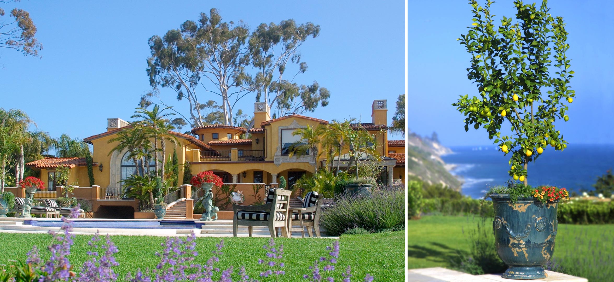
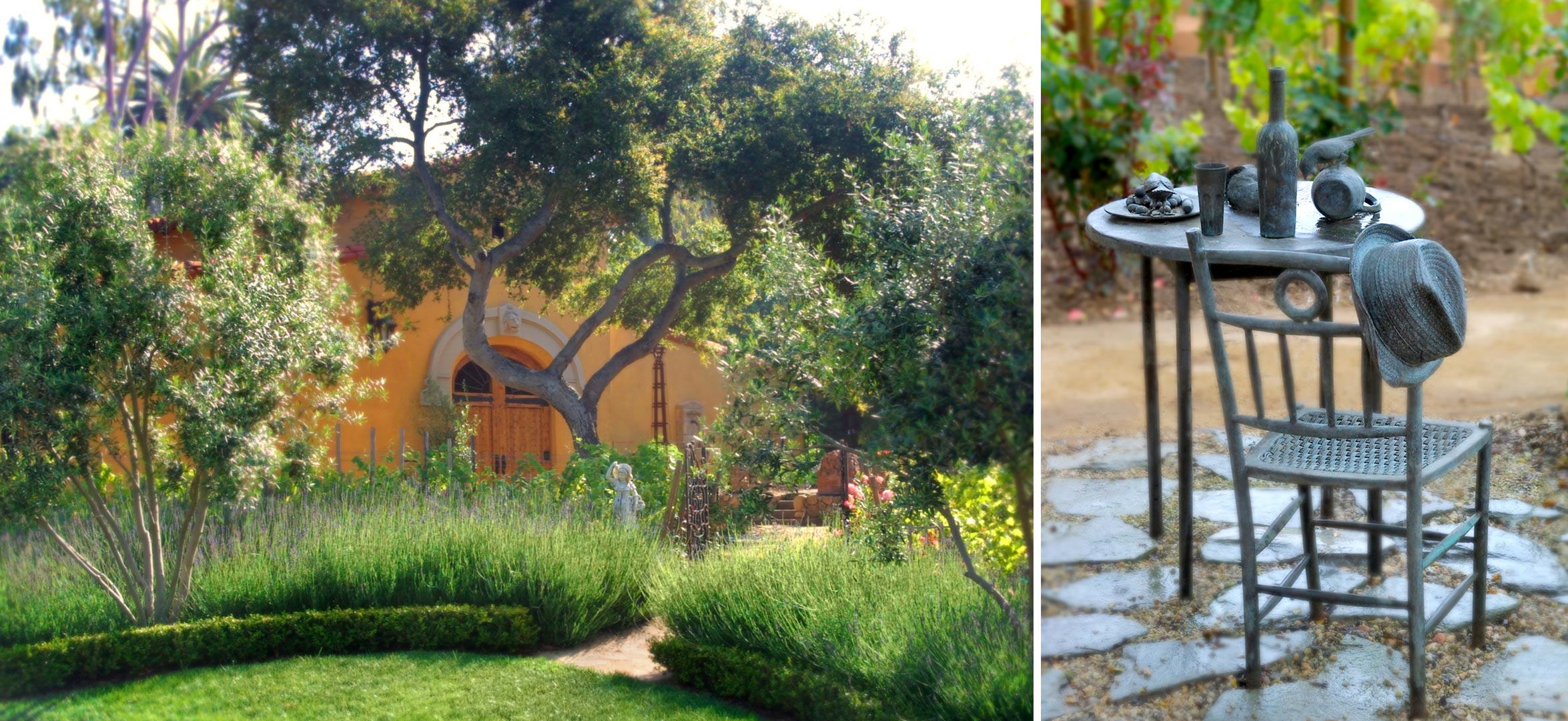
Chris and Alicia had lovingly built their dream home on a bluff overlooking the spectacular Santa Barbara coastline. Once the house was finished, they turned their attention to the grounds, which rambled across three acres of land. Some hardscape had been installed, and several distinctly different gardens had been conceptually defined. But huge, nearly insurmountable challenges faced landscape designer Margie Grace when her firm, Grace Design Associates, were brought in to replace the previous landscape designers and contractor. The project was way past deadline, over-budget, rife with grading, irrigation and other installation problems, and specific garden designs had yet to be created. The owners wanted their gardens installed yesterday, and Grace Design Associates agreed to take on the challenge.
The Design Challenge
Distinctly different gardens reading as a harmonious whole-- As listed below, the owners had defined ten distinctly different gardens to be installed across the almost three-acre site. How were these to be woven together into a cohesive whole, which in turn would compliment the Italianate façade of the 10,000 square foot house?
Technical difficulties were abundant -- Inheriting the legacy of the previous landscapers also proved difficult. The grounds had numerous drainage problems resulting from improper grading. Improper equipment had been installed in the many fountains on the property. And, the partially completed irrigation system was not functioning correctly. There was no time to rip everything out and start from scratch -- clever solutions were required to correct the faulty work -- and fast.
The landscaping budget had been compromised -- While the home was finally completed, construction and the interior design installations had more than doubled the original budget. The site called for a world-class garden, but the budget demanded resourceful solutions. The owners had spent years compiling scrapbooks of ideas for their dream garden, and they had already invested heavily in statuary and hardscape. They were unwilling to eliminate any of the dreamed-of gardens. How could elegant gardens be built on a slim budget?
Multiple conflicts of scale, style and historic period -- The owners had spent years collecting statuary, fountains, pebbles, and other decorative objects from around the world, which spanned different style traditions, cultures, and centuries. These had been shipped in anticipation that they would be used in the gardens, but all purchases were made prior to the development of the conceptual designs. How could these objects be harmoniously integrated into the gardens?
Installation would be logistically difficult -- Major hardscape elements had already been installed prior to the retention of Grace Design Associates, including adjacent driveways, walkways, walls, and patio flooring. Use of heavy equipment was out of the question in many areas -- additional hardscape materials, statuary and all plants would need to be hand-carried. The specific garden designs would also need to work with and around these elements, since there was no time or budget to uninstall them.
Sea air can be lethal to plants -- Sea air, laden with salt, and fluctuating greatly in temperature and moisture, presented another challenge. Many plants that thrived inland would perish under these harsher conditions. This limited plant selection, and made the whole issue of plant selection critical to the long-term success of the landscape.
The deadline was tight -- The owners had already been through a series of landscape designers and contractors who were unable to deliver on the job. The final garden design and installation was already months behind schedule, and the owners were frustrated, and unwilling to tolerate further delays.
The Solution
In just 90 days, Grace Design Associates pulled off the minor miracle of designing and installing ten separate, beautifully designed gardens that amazed and delighted the homeowners.
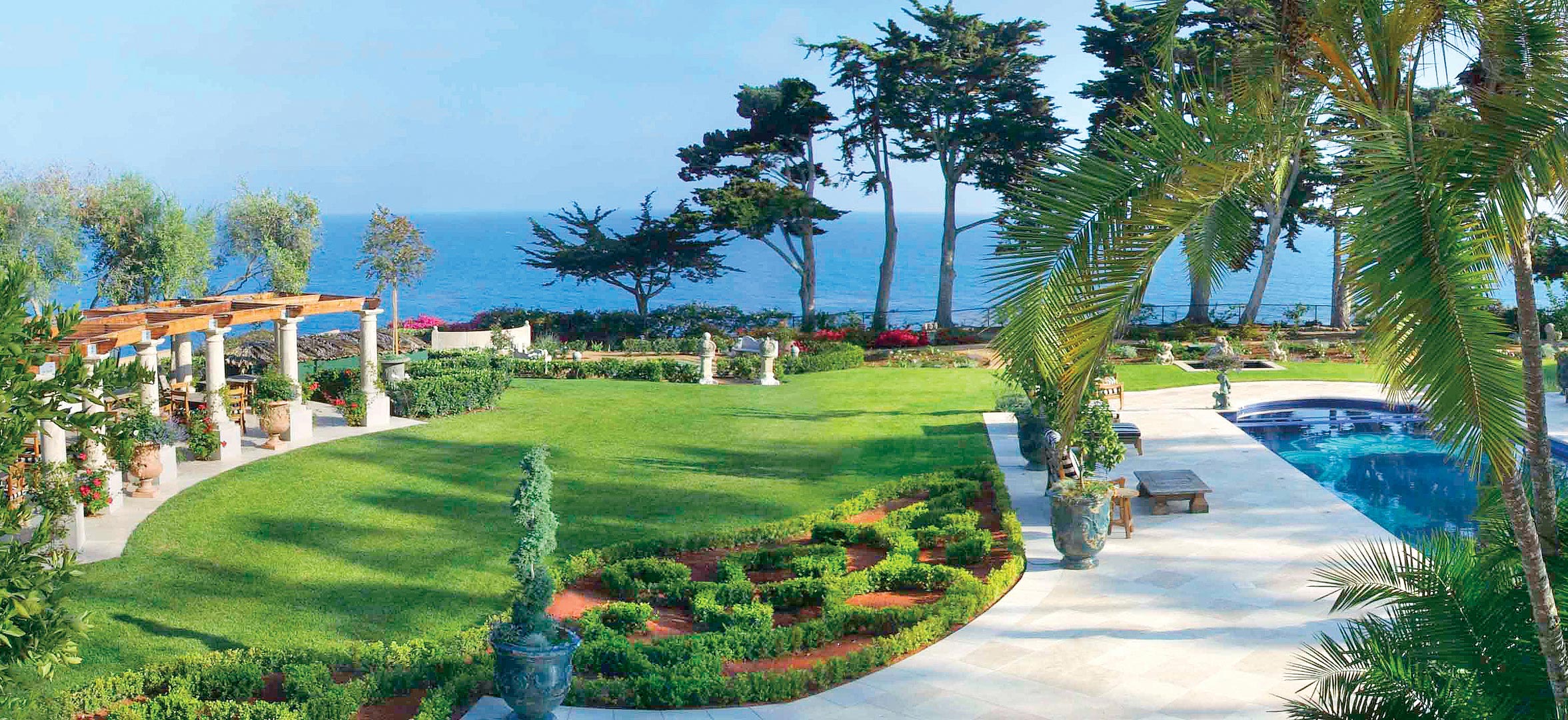
The gardens rendered as a string of pearls -- Each of the ten gardens was separately designed to be its own special jewel. And yet, when viewed from afar or from the grand terrace above, several of the gardens and numerous garden elements are linked together as a string of pearls -- the White Garden, the Christmas Tree (a large deodar underplanted with white foliaged "snow"), the Theater Garden, the Perennial Border (mandated by the coastal commission to protect the bluff top from failing), the Koi pond, the Queen's Garden, the Pergola and the Herb Garden all flow in a loose chain around the perimeter of a central back lawn. This design concept drove many of the other design decisions and specific design techniques, as described below.
Texture and form provided unification -- The ten gardens were unified by Grace's decision to work with texture and form throughout. These design elements were repeated in each of the ten gardens, while still allowing them to retain their distinct identities.
Hardscape elements were linked -- Because the previously installed hardscape elements varied in texture, tone and color, Grace Design Associates utilized decomposed granite pathways to circle the estate, and to link the ten gardens together.
Object scale was carefully managed -- The statuary, hardscape elements, and fountains were carefully separated throughout the landscape, in order to de-emphasize the disparate sizes, colors, and points of origin. For example, a six-foot high Buddha, a 12" high prayer bell, and a massive, 1,500 pound stone urn were strategically placed in the Zen Garden to compliment the whole, and yet not conflict with each other. Additionally, spectacular tree specimens were chosen and carefully placed to provide a counterweight to the other objects in this particular garden.
The Ten Estate Gardens
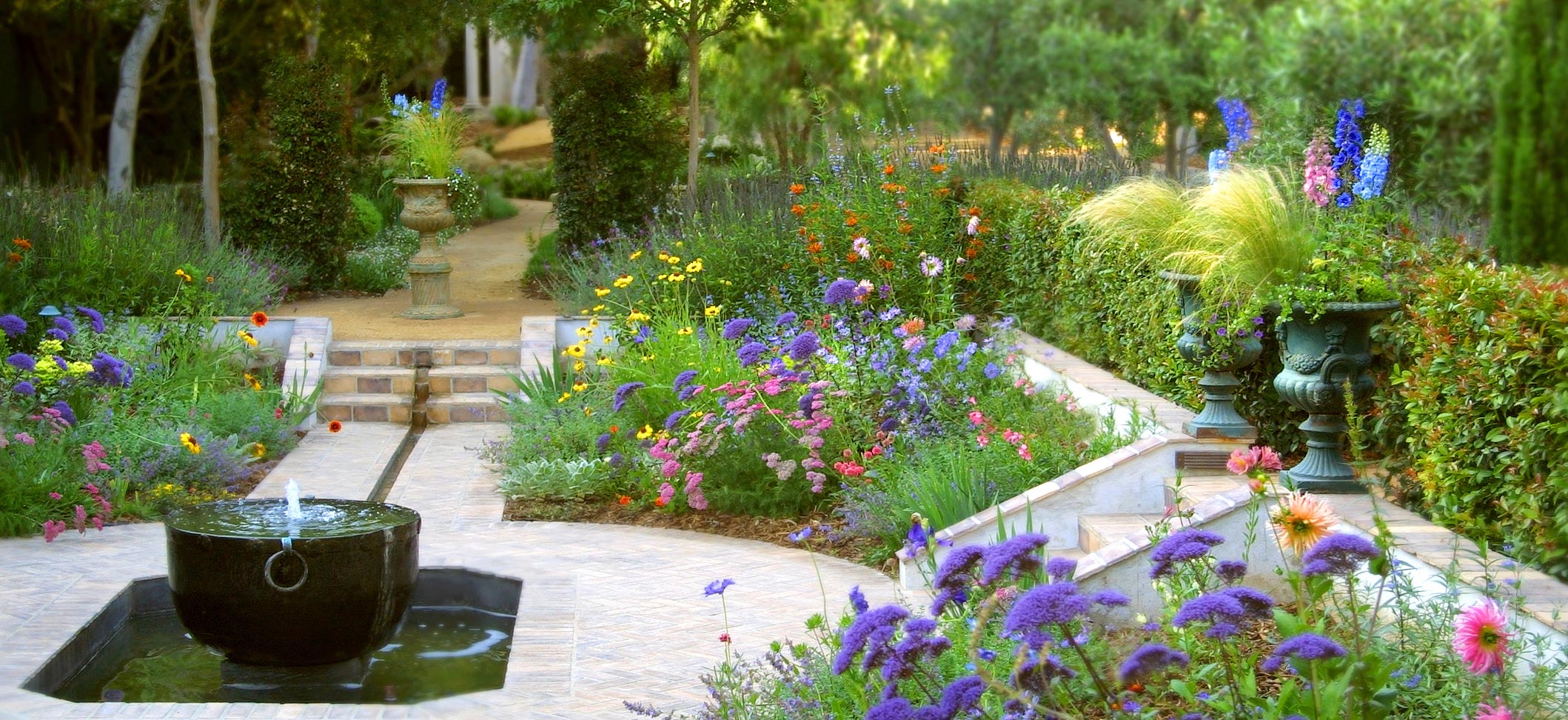
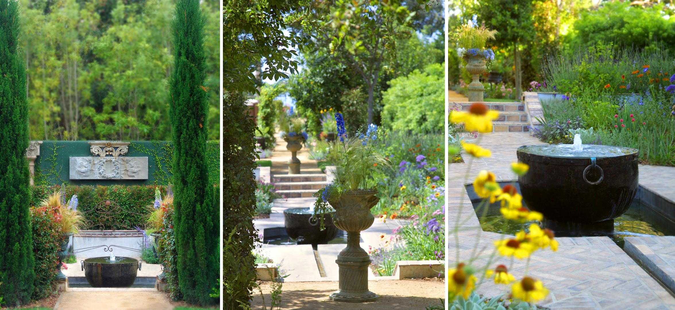
The Sunken Garden -- Inspired by the Sissinghurst Castle in England, the Sunken Garden provides a sense of separation and shelter. From the outside, one feels lured to this quiet space lodged between walls of hedges. Once inside the sunken garden space, there are benches to invite lingering, and blousy perennial beds that harken back to the original castle inspiration, but that reflect the more relaxed design sensibilities of Southern California. The garden has a sense of spaciousness, even though its footprint is small. This is accomplished through the division of the space into four distinct quadrants, with a large copper pot transformed into a fountain sitting within a small pond as the central focal point. Also, the plantings are highest towards the edges, forming a 'bowl' shape. Combined, these elements give the illusion of spaciousness inside a protected area.
The Zen Garden -- The Zen Garden is located towards the front of the house, and must be passed through to enter the home. In order to ground the garden and give it an appearance of scale in front of the large house, pathways and grading were used to define three separate spaces within the one garden area. The spaces were also used in classic Japanese style to exaggerate perspective, creating the illusion of a much larger space. Framed by an antique Asian 'humble door', where one must stoop to pass through, the Zen Garden features an elegant, understated design emphasizing texture and form over color. Several spectacular items from the owners' collection were included. A six-foot high plaster wall on two sides of the garden serves as an 'art gallery' where additional decorative objects are displayed, including a 400-year old tile dragon and two ancient stone etchings.
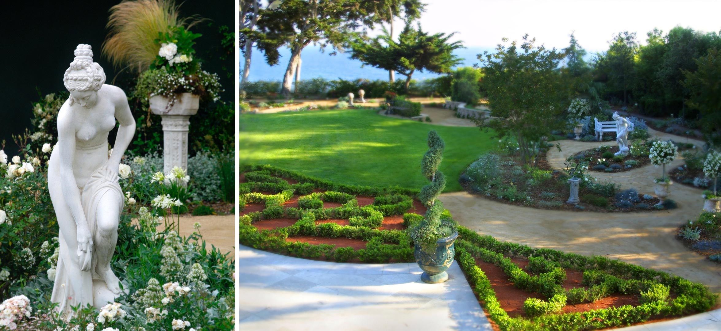
The White Garden -- With many of the objects the owners had collected over the years designated for the White Garden, Grace treated this space as an outdoor 'gallery.' Multiple paths connect and differentiate distinct gallery 'rooms', each of which has a unique feel and look. The white palette was used to unify the gallery rooms. Plants with silvery blue or white foliage were also favored to extend the theme further. Thoughtful plant selection provides year-round blooms.
The family wanted to have an outdoor Christmas tree, so the Deodar tree -- also known as the California Christmas tree -- was selected. Its silvery blue foliage compliments the other plantings in the White Garden and the underplanting of snowy white-foliaged plants inferring snow harmonizes with the rest of the garden. Throughout, there are inviting places to contemplate the many beautiful objects, including statues, a long low marble wall, columns, sundials, armillary sphere, urns and finials.
The Theater Garden -- Modeled on the theater garden at Lotusland, the Theater Garden contains a raised stage with a earthen floor. The backdrop, curtain and wings are comprised of Popocarpus hedges. The footlights and power source for additional lighting and sound are discretely built into the design. The audience sits on a low stone wall backed by a boxwood hedge to give the space a sense of enclosure. Outside the boxwood hedge are two large iron benches that face into the yard opposite the theater towards the pool; if additional seating is needed, these benches are easily turned around to accommodate larger audiences.
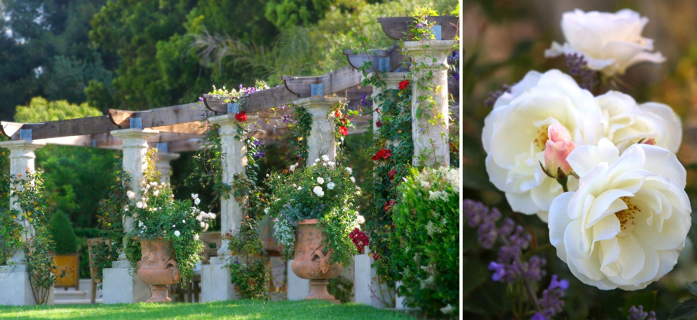
The Queen's Garden -- A giant chess board is the central focus of the Queen's Garden, inspired by the adventures of Alice in Wonderland. The life-sized chess board is comprised of two different colors of pebbled concrete squares interplanted with Blue Star Creeper. The board is enclosed in an oval of privet hedges. In Alice in Wonderland, the Queen insisted the white roses be made red. So, in playful reference to the garden's inspiration, one end of the oval is planted with white roses; the other end contains red roses. Two massive urns brim with Fourth of July roses, which are white with red streaks, further referencing the scene from the book wherein the white roses are 'painted' red. From the owners collection of garden objects, Grace selected several salvaged architectural items -- carved marble crown-shaped finials and capitols were combined with short columns to make king and queen chess pieces, a Tudor chimney suggests a rook, and some bollards look for all the world like pawns. These were set around the chess board to complete the fantasy.
The Pergola -- The Pergola contains an outdoor kitchen and defines an entertainment area. Reflecting the architecture of the house, the Pergola is comprised of a dozen columns topped by heavy timbers. A fabulous marble bas relief mounted on a low central wall creates a striking focal point. Heavy teak furniture provides ballast below. Already installed when Grace Design Associates was retained, the challenge was to ground the Pergola with the other gardens, and to give it a context. The solution was to cover the Pergola ceiling with a riot of white wisteria, purple clematis and scarlet Altissimo roses. Large architectural urns with opulent plantings further ground the structure.
The Herb Garden -- The Herb Garden is comprised of raised beds of varying heights arrayed in a geometric pattern around a central fountain. Taken as a whole, the hardscape here, installed by the previous contractor, created a sharply angular, visually busy space. A strongly geometric layout of soft, line-blurring plantings with closely spaced trailing herbs are harmonious with the symmetry of the hardscape, while softening its hard edges and razor-sharp lines. Large urns, planted with citrus, are placed to further break up the harsh geometry of the hardscape. Lemon yellow antique Anduze planters add unexpected pops of color to lighten the mood of the space.
The Vegetable Garden -- The vegetable garden lies between the motor court and the stable, both of which had already been constructed when Grace Design Associates was retained. Due to an error in the property survey, the grading was severely off, promising flooding inside the stable when it rained. This issue was resolved by creating a raised vegetable garden, constructed with dry-stacked sandstone walls. The raised garden is laid out with two primary pathway axes that can be accessed by two stairways and a ramp. At the intersection of the two paths sits a large stone planter, pierced with an ornamental copper sprinkler and planted with salad greens. Strawberries, planted in the crevices of the dry-stacked stone, cascade down the face of the wall.
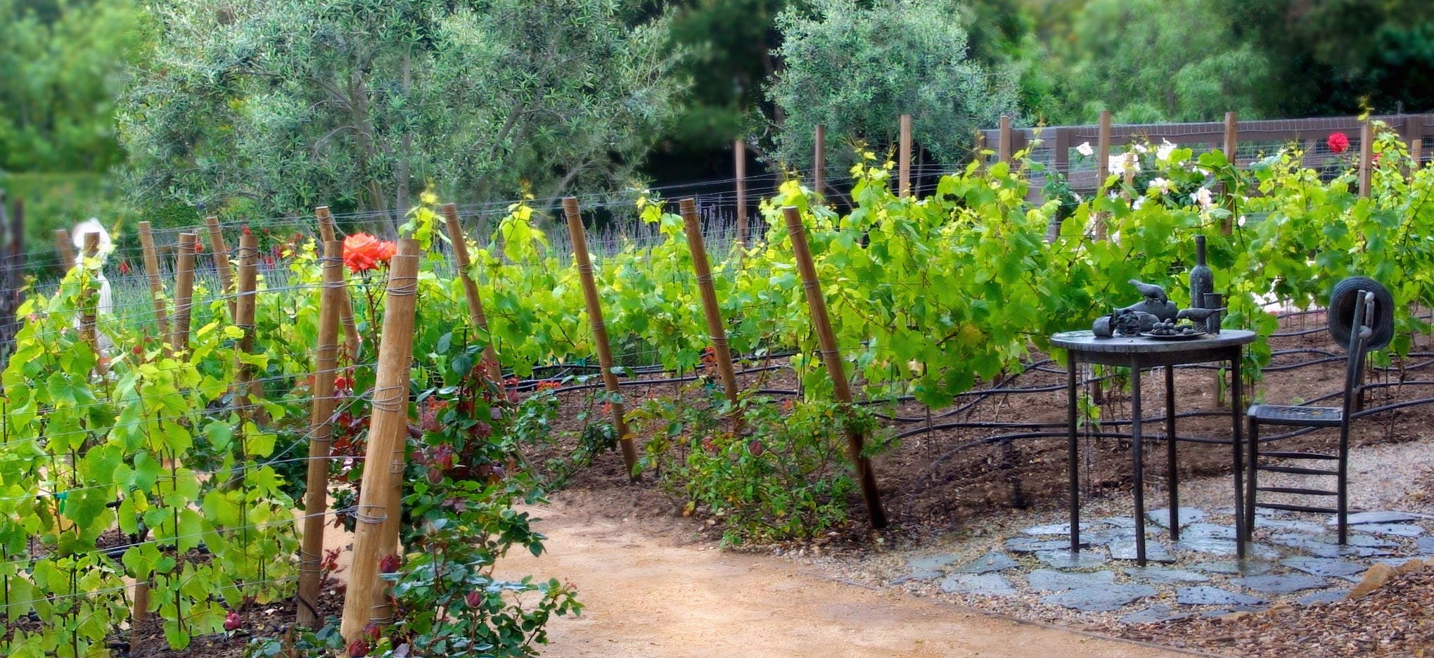
The Vineyard -- A path meanders through the middle of the Vineyard, inviting family and guests to stroll through it as they pass to and from the vegetable garden. The Vineyard is graded into a gentle rolling space sandwiched between the motor court and the stables. To create the sense that the Vineyard had been carved out of the native woodland, the vines wrap around a large Live Oak. Over 100 Pinot Noir Clone 115 vines -- the best choice for hardiness and tolerance of ocean influences in Santa Barbara county -- are planted to run in diagonal rows, giving the illusion of an even more expansive space. A rose is planted at the end of each row. The roses add beauty and serve as indicator plants, more sensitive to fungal and insect infestations than the vines. In this way, incipient pest and disease problems can be identified on the roses before the vines are compromised.
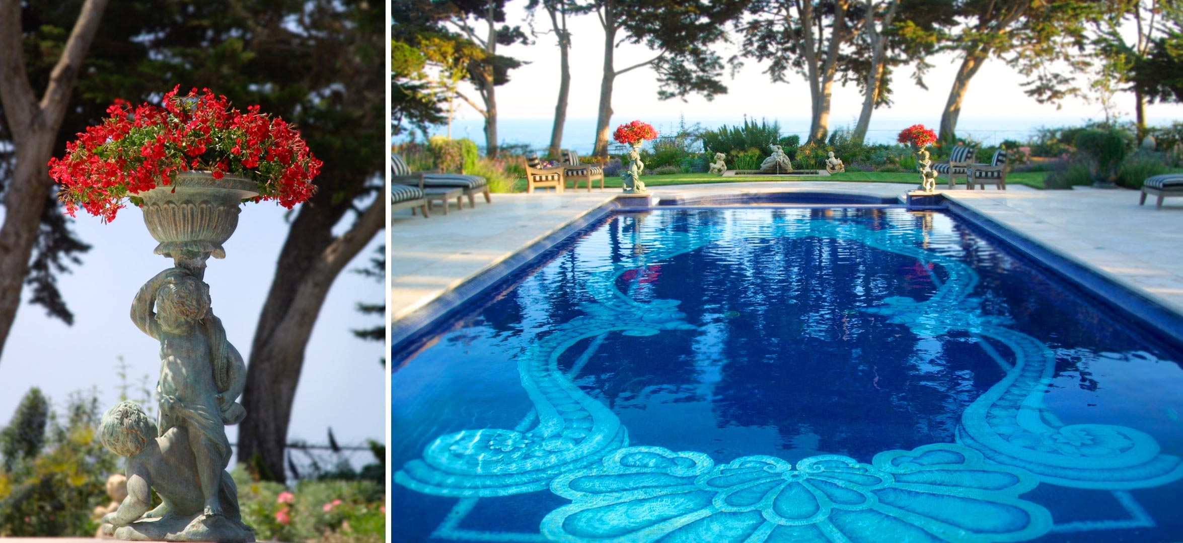
The Parterre -- The owners had a photo of an enormous French palace parterre garden, and said, "We want to do that, here!" The only problem? The available space was just 15' x 30'! Already installed nearby was a fabulous pool with a tile pattern inspired by a Versace plate. The owners wanted the parterre to mimic the Versace plate/pool pattern. How could this parterre design be rendered in a very small space and still have the pattern be readable from both ground level and from both ends of the pool? The solution was to select fine textured boxwood as the hedge material and to mulch between the hedging with red brick dust make the pattern 'pop'.
Awards
Santa Barbara Contractors Association, Builder of the Year: Best Landscape and Hardscape 2003


